10 Web Design Trends to Lead the Way in 2017

Happy new year from the team here at Artonezero! With the new year now truly upon us, it is time to take a look at some of the web design trends that will be leading the way in 2017.
With digital technology becoming more advanced and even more ingrained into our daily lives, users are demanding even more than ever from their online user experiences (UX).
What will 2017 bring to web design?
With users wanting a UX experience that is more personal, interactive and relevant, web designers in 2017 face the challenge of developing websites which understand and respond to users throughout the process.
With that let’s take a look at some of the web design trends that will be leading the way in 2017.
Web design to be replaced by “Web Experience”
The concept of web design as we know it is fading away. Famously, Eric Meyer stated in a recent Offscreen magazine that he stopped calling himself a web designer and now prefers the title “experience designer”.
In web design, as we know it, the role of the design was to make technology look good to the end user. In 2017 we can expect to see web design evolve into something much bigger. Web designers will now need to do more than making websites that “look good”, they will also need to design websites that account for the experiences and stories of their readers.
For excellent further reading on this read: Web design is dead. Long live experience design.
Conversational UI
2016 saw a rise in conversational interfaces with more and more people interacting with companies, services and bots through chat, messaging and other natural language interfaces.
As messaging platforms, such as Facebook Messenger, Slack and WeChat, increasingly overtake social network and app downloads, businesses are starting to think about ways in which they can utilize this change.
This means that the design of conversational user interfaces, on websites for example, will become a more important trend for web designers in 2017.
GIFs and animations
While it is true that a lot of websites and apps have been using animations for a while, what’s new is that 2016 saw the humble GIF go mainstream.
With GIFs now built into social media networks such as Facebook and Twitter, they can also be used for your web design.
A word of warning though: don’t overuse them. GIFs work well to draw user attention and help you to provide a richer product experience, explain a workflow or provide a guide for your users, but like any good thing, overusage diminishes the impact.
Next gen responsive design
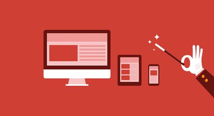
2017 will see responsive design continue to flourish because, simply put, it has proved to be one of the most effective ways of achieving a good UX.
CSS media queries offer website designers flexibility to create websites that adjust according to whatever device the end user is accessing the website on.
In April 2016, Google updated its ranking algorithm to prioritize websites with optimized content for mobile devices and throughout 2017 we will see businesses re-boosting their content to improve their Google ranks.
Minimalism in web design
We can expect to see minimalism in web design to reach a whole new level this coming year, particularly with the trend of the “card” instead of a homepage.
The “card” is an entry point which acts as the doorway to more information. Within a website itself, other multiple cards can also be used to visually promote a topic and entice users to click.
To see this in action, take a look at the Netflix example below;
Data Visualization
With data and analytics becoming more important than ever big brands are now offering users a chance to see the stats for themselves.
By presenting data in visual ways, user interaction with this information is increased. This is particularly useful when it comes to understanding user representation and there are some great tools you can use to maximise it, for example, Tableau allows you to create colourful charts which are eye-catching and draw user attention.
Bespoke Photography
Quite a few of us in the Artonezero team have noticed an upcoming trend that we are in complete favour of; the decline of stock photography.
As website designers and users alike, I think it is safe to say that we all prefer to see bespoke pictures that really relate to the company or business.
Photography is a form of art that has maybe been lost in web design for a few years, but in 2017 I think it is safe to say that it is making a very powerful comeback.
When using photographs on your website the important thing to remember is that your website serves a purpose and therefore everything on it, including the images, must do so too. For example, your “Meet the Team” page can include images of your actual team, this will put a face to your brand and show your potential clients exactly who they will be working with. For example, we really like the Codeship meet the team page below;
Material design
Google has been developing Material design in recent years and now we are beginning to see it being steadily rolled out across its applications; including Gmail, Google Maps, Google Drive and YouTube.
Material design is a way of designing to create a hierarchy of meaning and importance on a web page, drawing the user’s focus to different areas all the while still moving and responding to the user’s actions; Google are naming the latter of these two Material Motion. Material design uses geometric shapes to enhance their site, create depth and realism. Material design is becoming more and more popular across the whole of the web and we can expect to see more of it in 2017.
To learn more about Material design, read Google’s introduction here.
Long-scrolling websites
2016 saw an emergence of long-scrolling websites which we can expect to continue into 2017.
Like all web design trends, long-scrolling websites come with their own pros and cons. While at Artonezero we do like to see more long-scrolling websites, mainly by the excellent examples of seemingly infinite websites like Facebook, Twitter and Instagram.
Facebook, Twitter and Instagram allow users to scroll for seemingly endless amounts of time, constantly seeing new content, and as human beings, we now seem to crave this stream of action. With this, many sites are now doing away with menus and tabs and are instead putting everything on one long page. These longer pages can then be broken up with images, typography and videos to add more action to the experience.
Big Typography
Expect big and bold typography to lead the way in 2017.
In 2016 we saw typography increase in size and boldness in design, but we can expect this trend to continue into 2017.
We can expect brands to adopt bigger, more eye-catching, even full-screen typography. Dynamic colours and textures will be added to vibrant and interesting fonts to create eye-catching effects. For example, see the screenshot of victoryjournal.com below;
Onwards into 2017
If our predictions are correct, we can expect 2017 to be a very exciting year for web design.
Bear in mind though, while some of these are great web design innovations, don’t rush into trying to fit all of these onto your own website. Some of these will work great for certain businesses, while others won’t. Always bear in mind UX and select the styles and capabilities that your users both need and want. Trying to use too many will decrease the UX of your website, so be selective, careful and creative.
If you think we have missed any important web design trends which will lead the way in 2017, or if you have any predictions of your own, please let us know!
Finally, from all of us here at Artonezero – happy new year 2017!


