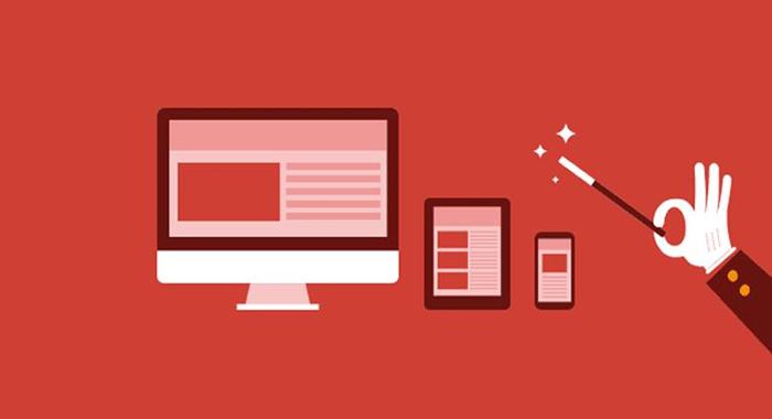
Think Mobile First for your new website

It is still common to consider a desktop version of your new website, before working on a mobile-friendly version. However, trying to create a mobile-friendly alternative to your shiny new desktop website can cause functionality issues and make it a nightmare to navigate.
With this in mind, more and more people are now considering mobile first when setting up a new website; let’s take a look at why this is and what the benefits are.
Over One Billion Mobile Web Users Worldwide
Mobile web browsing is no longer an up and coming trend, it’s not the future, it is happening right now. With an estimated 1.2 billion users worldwide and half of those surfing at least once a day, mobile web is the present. In the US, for example, around 25% of people who use their phones to browse the internet do not use a desktop. It is not a niche that should be considered once your desktop site is up and running, it should be at the forefront of your mind. By thinking mobile first, you’re ensuring that those 1.2 billion users are presented with the optimal version of your site and not just an afterthought.
Extra Capabilities With Mobile Web
One of the best things about creating a mobile website is that you have access to a whole range of extra capabilities. Of course, many of these capabilities can be used on desktop websites, but what if your visitors have out of date browsers and technologies? People are constantly upgrading and updating their handheld technology, far more often than their desktops. Some of the exciting new capabilities you can use on your mobile website include:
-
GPS – Millions of people now use GPS on their mobiles to find a local business and even directions to that business. Your mobile website can direct them straight through your doors; now imagine the extra benefits of that.
-
Multi-touch interaction – Want your visitors to be able to swipe through your services portfolio? Zoom into your product pictures? Multi-touch interaction on mobile websites is an exciting way for visitors to browse.
-
Audio and Video input – Imagine being able to receive messages from potential customers and website visitors, through their phones? You could set up face-to-face customer service, let visitors review your products, and even leave your voice messages from their phone.
These extra capabilities will allow your visitors to be more involved with your website, giving them more interaction possibilities. Whatever the industry of your new website site, there are plenty of ways you can interact with visitors via mobile browsing.
Cost Effective
Let’s say you’ve put together a brief for your perfect desktop website. You know the design layout you want, the colours and even decided how you want it to function. Now, you find out that your chosen design isn’t responsive (or is, but poorly so) and that means having a whole new site designed. You’re now paying out for two websites; one desktop and one mobile, because of neither functions very well on the other platform. You’re also going to have to take the time to keep both of these updated, with new content and functionality, on a regular basis. It’s going to be pricey and it’s going to take time. Now, let’s say you’ve put together a brief for your perfect mobile website. You know how you want it to look and function, as well as what extra capabilities you want to be included. Your responsive web design works great on mobiles, as well as tablets, and guess what? It works great on desktops, too. You have one website to keep updated now, not two. Mobile first web design is both cost and time effective.
If you are planning on a new website, make sure you consider going mobile first. You’ll still be ahead of much of your competition, whilst also saving time and money. What’s not to love?

